How Do I Add Items to a Dashboard?
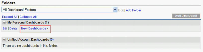
- From the Dashboard List page, click the name of the dashboard.
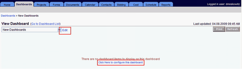
- Click the Edit link next to the name of the dashboard; or, if the dashboard does not have any items on it, click the Click Here to configure the dashboard link.
- Click Add Dashboard Item.
- Select a Component Type.
- Select a Report.
- Additional fields may be required, depending on the component type.
- Click Save to create the dashboard item.
Those fields will be indicated in red.
The report selected must be either a Summary or Matrix report. The dashboard item will display the summary results of the left most column that is summarized.
Types of Dashboard Items
The following are the types of dashboard items available:
- Chart
- Horizontal Bar
- Vertical Bar
- Line
- Pie
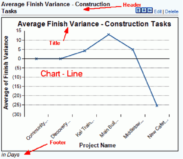
Chart
Chart Dashboard Items have a header, which appears above the item, a footer, which is listed at the bottom, and a title within the frame of the item.
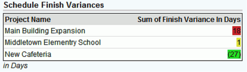
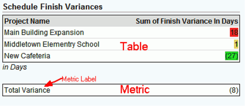
Table
The Table Dashboard Items have a header, which appears above the item, and a footer, which is listed at the bottom. They also have the option to color code the results based on two thresholds that you specify:
- Anything lower than the first threshold will be displayed in the Low Range Color
- Anything higher than the second threshold will be displayed in the High Range Color
- Anything in between will be displayed in the Middle Range Color
Metric
The Metric dashboard only displays the total of what is summarized on the selected report. Like the Table it has a header, footer, and color based on thresholds. It also includes a Metric Label. A metric will always be limited to a single row.
For metrics, you can add several metrics in a row and if there is no header or footer between them, they will end up displaying like a table. This lets you create your own table or grid. You would give a header to the top metric and a footer to the bottom one to make it look like just one table.
Oftentimes, a metric will be placed beneath another dashboard item to display its total.
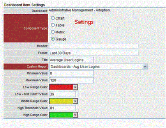
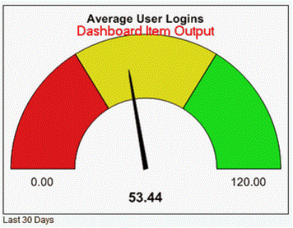
Gauge
The Gauge Dashboard only displays the Total of what is summarized on the selected report. It displays the results as a needle in between the range that you specify. You have the option to color code the results based on two thresholds that you specify:
- Anything lower than the first threshold will be displayed in the Low Range Color
- Anything higher than the second threshold be displayed in the High Range Color
- Anything in between will be displayed in the Middle Range Color
You should also specify a minimum and maximum value, which will set the range of the gauge.
Specifying X Axis Label Lengths
Trimble Unity Construct allows you to specify the length of the labels for the x-axis for charts you set up using the dashboard module which are either summaries or metrics, which are grouped by at least one category. This is helpful so that your x-axis labels are not truncated, causing confusion as to their identification.
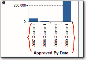
Look at the example below. This is a vertical bar chart set up to show a summary of the actual costs for a project, grouped by quarter. In the red rectangle is the field for setting the X-axis label length:
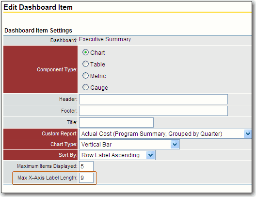
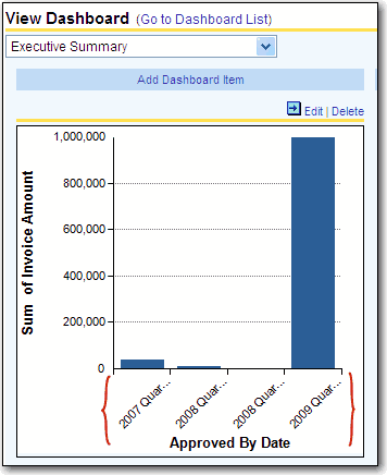
In this example, we have specified an X-axis label length of 9, which is the minimum. Notice that the labels are cut off (see items in the red parenthesis):
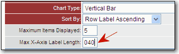
We can change the value of the X-axis label, so that the whole label is displayed. In this case, we enter 40 (the maximum value is 999):
Here is the resulting chart (labels in the red parentheses are displayed, no longer truncated):